"Little Red Riding Hoodlum" 90 x 75cm, Ink, Acrylic, Marker pens on Thick Paper.
Carrying on with my drawing project and the "Red Riding Hoodlum" print, I wanted to create the '
life' to accompany the bulldog hoody character and build a story and a body of work for my project.
I started by looking at 'tagging' on walls around Leicester and recording different blocks of flats, estates, streets, graffiti, roads, etc in my sketch book to build an image in my head of where this character might live.
I wanted to document an imaginary existence that isn't too far from the lives of real people.
Exo is a
'NEET', a term created by the government as a label for 16-24 year olds currently '
Not in Education, Employment or Training' of which there are over 979,000 in England which costs just over £22 million pounds a week in job seekers allowance.
"King of EastGrey Estate" and
"Victim of Society" are set in front of a burning red evening sky, full of his life, his habitat and his history. The images are all created in my mind, totally imaginary, but the life is very real and looks at a particularly large section of todays society.
Amongst the scattered graffiti are chemical symbols for recreational drugs, scrawled exerts from an imaginary diary, his tag name (EXO 111) and the the buildings and places he calls home.
I wanted the same gritty look that was seen in the french film 'La Haine', 1995, directed by Mathieu Kassovitz, which looked at life in a suburban ghetto. This black and white classic cult movie shows 24 hours in the lives of 3 friends caught up in a riot brought on by an aggressive police force.
"King of the EastGrey Estate" Jan 2014, Printers Ink, Marker Pen,
Acrylic on thick paper. 100 x 65cm.
"Victim of Society" Jan 2014, printers Ink, Marker Pen, acrylic on thick paper. 100 x 65cm.
Sketch book pages and research photographs:
Stair case of a tower block
These shots were taken around various high rise flats in the city and I think the striking lines, distinct tones, perspective and solid form make them really interesting.
The dark patterns and lines work well on red background.
Uncontrolled tagging
Urban Habitat
Rough sketches.
I've developed a way where the writing makes sense but isn't controlled enough to be understood.
Tagging sketches.
Through collecting photo's and images of different blocks of flats I wanted to continue my project with a drawing made from the various photo's. Working with rough sketches I arrived at a rough idea for a collage which shows the view seen by the tenants of these buildings every day. The towering blocks stretch upwards with perfect symmetry and never ending continuity.
The graphic abstract style of architectural sketches by Antonio Sant' Elia are a great source of inspiration for these images. The towers stretch up with strength and power but the hard direct lines are also delicately drawn by the hand of a great designer and artist.
Antonio Sant' Elia
Antonio Sant' Elia
Anselm kiefer looked at tower blocks for his installation piece at the "Hanger Biocca" in Milan. "The Seven Heavenly Palaces" presents a set of towers which were all structurally loose in design and had a feeling of being able to topple at any moment which given the sheer size of them and the protruding metal work made them threatening to look at. These towers stretch towards heaven, straight up and straight down, monumental and almost spiritual.
Anselm Kiefer
I like this idea of the towers stretching away into infinity and started working on a set of rough sketchbook pages to create an idea of the look I wanted to achieve.
I want the harsh black and whites of the structures to show oppression and power contrasting with the vivid random graffiti and highlight the contrast between the straight edges and the scruffy writing.
I want the images to have a monotone precisionist style, flat and geometric like Demuth's "My Egypt", 1927, but with the modern exciting twist of a recent colour-filled graffiti attack.
Two rough sketches for the final piece.
The four images below (all A3) bring all the elements together in a dramatic set of exciting prints. Combining chaotic colourful graffiti, uncontrolled text and contrasty monotone photographs gives a glimpse of urban culture to the viewer and a realistic view of Red Riding Hoodlums habitat.
For the next drawing I concentrated on the claustrophobic yet endless towering structures that EXO sees all the time. We see these places and wonder what goes on inside but rarely get the opportunity to find out. To a lot of people they appear as a threat, somewhere not to go. To EXO they are home, safety and in a way, freedom.
I wanted to 'draw' with the photographs I'd collected and screen printed the various pieces onto the paper before adding text and tagging.
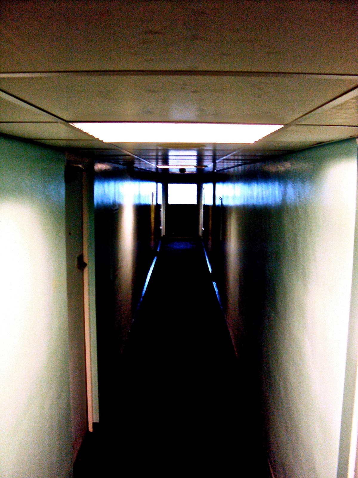
The next stage was to get inside one of the tower blocks in Leicester to wander the hallways and get some photo images. The first thing I found was how claustrophobic these places feel when you walk in. The doors are all mechanically operated with key pads and digital entry systems.
The thing thats started to really stand out to me is how repetitive these buildings are. Every floor of the 15 I walked through is exactly the same as the one before with the only difference being the slight change in paint tone on the walls and the strength of lighting which varies due to bulbs being blown.
I've never spent any time in a prison but this place made me feel like I was in one.
The guard on the front door told me not to take any photo's of the residents which live in the 275 flats but I walked 15 floors, every corridor and hallway and didn't see a single person except for the guy behind the glass door who literally scared the shit out of me. The place was eerily quiet with the only noises being distant door slams and occasional voices behind locked front doors.
The next set of shots were all taken on the outskirts of Leicestershire. The graffiti has been made on farm buildings in the middle of fields, nowhere near any housing and totally isolated.
I like the idea of nomad graffiti artists making the effort to travel to new isolated places where they can leave their mark before heading back to their own environment.


.jpg)