Sunday 21 September 2014

Private View, Wiverton manor, Blakeney.


'The Last 9 Months' exhibition by artists Tom Lamprell, Francesca Perkins and Louuis Hudson was situated in a lovely old stone barn on the grounds of Wiverton manor in Blakeney. Across the crumbling brickwork the artists works showed a good variation of techniques, mediums and subjects but the way they'd been curated made the show a success as all the pieces worked well next to each other.


Louis Hudson works with salvaged wood and incorporates them into painted canvas' giving them a 3D, growing feeling but the works spoke of ecological questions in the local environment.

Francesca Perkins paints large landscapes on canvas using thick brushstrokes through deeply applied acrylics which reminded me of David Hockney's latest collection of large countryside views.

Tom Lamprell looks at the local people in his portraits but the way he paints gives them a sinister, creepy look which I think adds a bit of an edge and gives the viewer more to question about who and what they're looking at.


Monday 15 September 2014

MA Show 2014.

The MA show was a really interesting collection of paintings, drawings, sculptures, video and photography. Set in the art factory studio spaces, the show flowed easily with each artist selecting the best of their work from the course.
In a darkened space entered through a black curtain, Leila presented us with a gripping, intense video piece entitled 'They believed the river did sing'. This piece concentrated on feelings and experiences in sound and vision and as usual with Leila's work it was impossible to leave before it had ended. I personally got the feeling I was in the trenches during a war and the heavy sounds, clattering, bright explosions of light and eery noises all added to this feeling. Glimpses of fluttering birds of prey blended with dark landscape close-ups gave a feeling of excitement and unease which I like in artworks.
Her other photographic images were taken from the 12th floor of the soon to be demolished council building in Leicester and looked at changes in time and location.

                                                                                                    Leila Houston. 

One of the works that really stood out to me was the sculptural lightworks of Mark Boot. Entering into a darkened space I was greeted by the warm glow of red, green and yellow lights breaking through the surface of large sculpted pieces of polystyrene foam. This room was exciting, comforting and the glowing colours gave off a visual warmth but the work had a technological side to it. Mark's work looks at the way we have developed a coded system throughout the world and our lives and the way it affects our culture.

                  
                                                                                                                            mark Boot

Various interesting and playful wooden sculptures littered the floor in one of the spaces and on close inspection it was apparent that the pieces were combinations of man made and natural materials working together to hold the sculptural forms in place. Some of the pieces were made to encourage viewers towards moving the components around thus creating new and fresh sculptures throughout the show. The works were both simple and complex in creation and Edward Vernon's ideas of 'natural complementing man made' came across in each piece. 

                                                                                                  Edward Vernon

                                                                                    Edward Vernon

'According to Henry Mattise, colour, even more than drawing is a means of liberation exists in itself'.
The opening statement from the artist Lydia Manship highlighted the ideas behind her colourful projected installation. blending through endless colours, the squares and circles of her simple compositions kept the room alive with just subtle changes every few seconds. The work was all about colour and what happens to it and to us as the tones appear and disappear before us and reminded me of a scene from an old 60's pop art movie. 

                                                                                                                              Lydia Manship

One thing I noticed about the whole exhibition was how professional it all looked. Each artist had stuck to their guns and only exhibited what they thought were their strongest pieces. Each room was different and the whole thing was a good experience. 

                                                                                                                                 Dee Sowden

                                                                                                                                   Dee Sowden


                                                                                        Lulu Zhou


                                                                                                                            Chiara Enzo


                                                                              Chiara Enzo

                                                                         Stefania Laccu


Thursday 21 August 2014

Friday 8 August 2014

new work

Our nation has become a land of followers. We devour slogans which are directed at us constantly and over time we believe and we start to follow. We don't need to vote for the next big thing but we do. We're told to.
 Celebrity is created through constant media download. Commercials instruct us to buy the things we simply cannot survive without and TV show adverts tease us with whats to come. Inevitably it results in an anti-climax.
We've become a nation thats easily led by slogans, messages and signs.

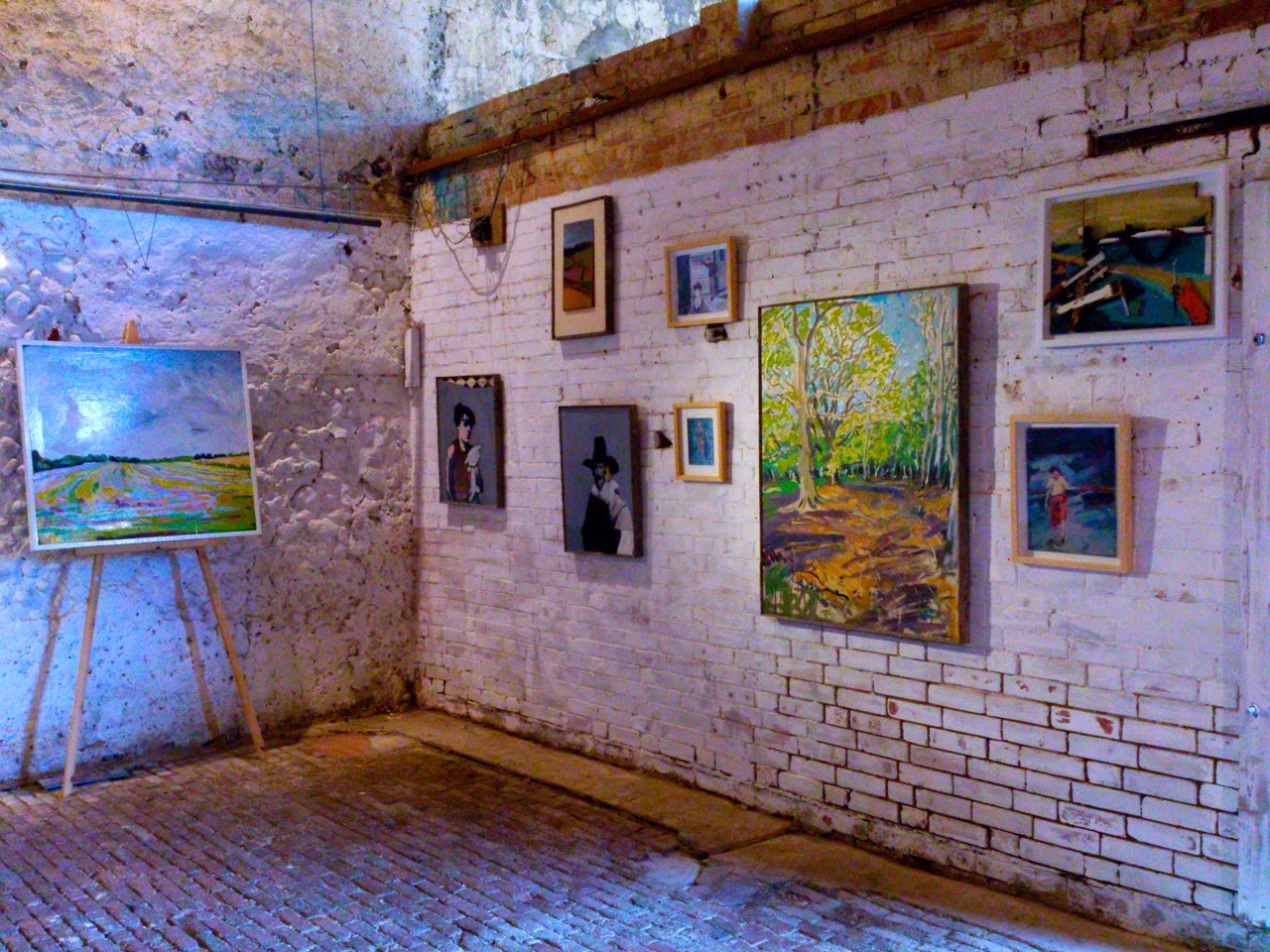
'Do As Your Sold...no.1',   Household paint on black canvas, 60cm x 30cm.

This gives me the idea that we can change a persons attitude with a simple set of words. One single word, whispered or shouted, can in an instant enrage someone as-well as calm them. The constant pressure of being told to 'VOTE NOW' can eventually see you making that call or sending that text. 

I like the idea of using these words and creating signs to alter peoples attitudes towards the day ahead. The traffic moves slowly along the busy road every morning. Cars are filled with job hating workers heading toward what they already regret. Can my signs change this? I doubt it very much but just for a second they may encourage something, start the ball rolling and bring the idea to life inside someones head. 


These are my hope signs; 'Highway Observational People Empowerment' signs. 


I like the idea of them popping up at the side of the road for people to see on the way to work. Of course, they don't all have to have a positive message. My mood for the day can change the sign I put up, thus changing the mood of the people reading it. 
All week you see positive encouraging signs then on friday one that reads
 'You've got to do it all again next week"....

I want the signs to be seen and questions to be asked by the viewer of themselves and the lives they live. Viewers can use them. Be inspired or encouraged but then at the same time the possibility exists that the signs can anger you, make you realise things, empower you. They have multiple meanings.
I'm interested in the way the words become 'owned' by the viewer. The actual signs stay fixed to one spot but the words go with the viewer. They look at society today, the way we live and survive. How many people hate their day to day routine but in this world of job shortages, huge mortgages and recession can't do a thing about it. 


The words can be placed in situations to create an atmosphere. This garage door would entice you to look inside but at the same time you'd have the feeling that something terrible may lie inside. A simple message that works in two different ways. Because 'no one should see'... I want to see. 


charcoal work.

The inevitable black expanse and the point reached.


Thursday 7 August 2014

Frontrunner Research, Evaluation of Audience Engagement.

Weds 6/8/2014.  Meeting with Dr. Sophy Smith. 
This research is to highlight and Evaluate the role of Audience participation and engagement at  exhibitions housed in the gallery space of the Phoenix Arts Centre.
Our first meeting was to discuss, with Dr. Sophy Smith, the processes, direction and outcomes for the project and gain an overview into previous research carried out last year.
The focus of the research is to assist the Phoenix and highlight the experiences of people entering, viewing and participating in the digital art exhibitions and produce a paper detailing our findings.
'Video cued recall', questionnaires and verbal feedback will be used to provide insights into viewers thoughts and feelings towards the exhibited works.

Fri 8/8/2014.   Introduction meeting.
Met with other front runners and the frontrunner team to discuss the projects we'll be working on and get an insight into what's expected and how to get paid etc, Essential info!

Thurs 14/8/2014.  Team Meeting.
Met with Dr Sophy Smith and Professor Ernest Edmonds to discuss the reasons behind the project and outline the artists who might participate in the research. Also had the chance to watch the previous research footage which had been filmed in the gallery space at the Phoenix centre. The footage was accompanied by written transcripts and statements collected from visitors and participants and was a good indication of what we'll be aiming for.

Mon 22/9/2014 Meeting with the artist.
Today was a chance to meet and discuss the project with the artist Esther Rolinson.
Esther is a well established visual artist working in public spaces to create site specific installations in various mediums. Her work engages the viewers experiences of built and natural environments.
Her installation piece for the forthcoming October exhibition is a very interesting combination of sculpture, technology and light and the visitors will be able to walk amongst the piece when its installed in the Phoenix Centre. The main point of todays meeting was to establish the questions she'd like to ask visitors to the space and to look at the proposed installation and her very in-depth creative process she has used to reach the finished piece.


Tuesday 5 August 2014

Monday 4 August 2014

New work...

I've been looking at the personalities of people, hidden sides and secrets. Its the thing of whats inside us that interest me, what we do and who we are. The stripped back and the hidden. Some people are bare, some wrapped tightly.

I'm working towards something but not sure what yet?


The outcome created through different media interests me. The theme stays the same but the overall look of the finished piece, which is 3D and lit with an old wire lamp, makes the finished piece a lot more intense and more of an experience. What experience would a closed room full of tightly crammed faces and time controlled lights create? 


Looking at each image we see its the eyes and mouth that give away the subjects feelings towards the viewer. The stares can show fear, anger anxiety and rage. These features alone could be something to concentrate on. A large blank space with one feature? 


Kathe Kollwitz.

 Kathe Kollwitz, 'Mother with dead child', 1903, Etching, 42 x 48cm.


At first glance its hard to tell exactly what this image is. The subject, with its delicate edges and soft detail blends into the background and it takes a few seconds to decipher what we're looking at. 
Created with a skilled hand through the process of etching 'Mother with dead child' is filled with emotion directed at us with a message from the artist. 

The slumped, lifeless body of the gaunt child lays in the folds of his mothers arms, tightly gripped by the oversized hands in a protective embrace. The child looks weak and fragile against the heavy strength of his mother. 
The image is all about protection and suffering but ultimately loss. 

The German artist Kathe Kollwitz looked at the suffering, hardship and poverty of humans in her works and the war had a major impact on what she produced and her her sculptures relay the same feelings.


' Kathe Kollwitz, 'Mother with twins' 1937, Bronze sculpture.


'Mother with Twins' again shows us the protective urges of parents over their children. This strong, solid piece of sculpture is softened through its subject. The mothers hands, arms and legs wrap around the children trying to protect and shelter them from the harshness of the outside world and the nakedness gives them a togetherness but also a feeling of vulnerability. 

Kollwitz showed her inside self through her work, her personal suffering and heart ache. She lived through 2 wars, lost her son in the trenches and she was heavily scared by the things she witnessed in Nazi Germany. But without this life would she have made these works with such feeling and emotion?

Kathe Kollwitz died in 1945 after producing a large body of work including an ongoing set of self portraits showing, in great depth and honesty, the change in her face through the years. She left her mark on not only the art world but also Germany where over 40 schools are named after her. 


Friday 18 July 2014

'Wols'.

I've recently discovered the fascinating work of the German artist Alfred Otto Wolfgang Shultze or 'Wols' as he was known before his death in 1951.
His early works, made with pen and ink are drawings and etchings made with a push towards experimentation and the creation of something that hadn't been seen before.
These delicate yet direct studies are complex in form and subject but could be seen as ideas recorded on to paper for future reference but are actually finished pieces.

                                                                                Untitled 1937. 

Wols' paintings appear to be influenced by the world around him but he takes what he views then turns it into what he wants us to see, his own vision of the world. 
This is particularly apparent in his 'Windmill' painting.

                                                        'The Windmill', 1913, Oil on Canvas, 73 x 60cm. 

At first glance we don't see what it is. The paint is scraped, scratched and dragged onto the canvas in a very hasty, rushed manner but Wols knew what he was doing. He's concentrated on the movement, the liveliness and the overall abstract reality of the scene instead of the form and structure. Once given the title we can instantly see what it is but without this we are left wondering, and thats the beauty of his work. Did he produce this work whilst studying a windmill or did he give the painting this name after he'd finished because it resembled a windmill? 

He tells a story with each piece but these stories need to be explained for us to fully understand and appreciate what we see. Once explained, the true beauty shines through and we can fully take in what he's presented to us even if at first it looks like a spontaneous attack on the canvas. 

Again we see his love of experimentation coming into play. Each stroke of paint is direct and builds a strong but loose form. 
The colours, bright yellow, green and brown suggest a sunny day with the structure set against a countryside landscape backdrop but this is only suggested and we need to decide if thats what were actually seeing. He gives us the basics but We need to finish Wols' story ourselves. He is a master of experimentation and expression through shape and mark making. Nothing is as it seems and the title and explanation are a spoiler for me. I don't want to be told what his paintings or drawings are, I want to enjoy what I see, especially if I don't know exactly what I'm looking at.


Thursday 22 May 2014

DMU 2nd years and Kevin Holdaway exhibitions.

KEV HOLDAWAY

Kev's exhibition at the Curve Theatre in Leicester was, as expected, full of perfectly made printworks. His choice of subject, bright eye-catching colours and his meticulous eye for detail guarantees brilliant finished works.  I've always loved the medium of print and Kev's work is an inspiration to me. A lot of the prints are made with complicated reduction techniques and multiple layering of ink but watching Kev work in the studio always makes it look really easy, which I know it isn't.
Well done mate, excellent show.


2nd YEAR GROUP SHOW

The 2nd year show was interesting with a big mixture of different styles and the overall experience was good. Two pieces which stood out to me were the large drawing by Amy Packham and the portrait paintings of Piotr.
Amy works with nature and makes line drawings which are full of detail and pattern which echoes the natural patterns which occur in the things she draws. The works cross the line between fine art and illustration which is fine and she looks like she could do well in either one.

  
Amy Packham. 

Piotr showed a collection of paintings in his usual style. beautiful faces emerge from detailed backdrops of fashion prints and designs and I know from talking to him about his work that his mother is a fashion designer and this influence really shows through in his finished paintings. Piotr has a definite style of his own and sticks to it which I think is a good thing. He makes the paintings from copying magazine images and mixing them with his own designs and the effect is quite eye-catching. Definitely some of the best works in the show. 

Piotr's painting. 

Tuesday 13 May 2014

Drawing feedback 2014...

My drawing feedback from Andy was very positive with an A as my mark. 
This has been my strongest and most enjoyed area of this first year at DMU and I intend to carry on experimenting in drawing until I find a style that is unique to myself. 


Sunday 20 April 2014

self directed project 2014 statement

I made this work as a response to seeing a group of hoodies in the centre of Leicester. One kid in particular stood out to me and I wanted to create a character based on him and the life I think he may live.
I'm inspired and intrigued by whats going on in the UK and the people living in different circumstances and situations and this work represents a growing section of todays society.
The project took me on a journey around areas of Leicester I hadn't seen before and through photography I recorded the scenes then reproduced parts of what I'd seen through various mediums including woodcut printing, screen printing, drawing, painting and discarded materials recovered from the areas I visited.
The life I've created is very much a work of my imagination, a false portrait of a real person, but is intended to reflect a very real way of living and is built from experiences I've had whilst researching the character.

Thursday 17 April 2014

Drawing project statement.

My drawings are inspired by the places I see as I wander the streets of the city. Unlike a lot of people I look upwards as I walk and am driven by a never ending desire to see whats around the next corner and I see a real beauty in the mundane structures. I'm attracted to the buildings and how they come together to form the streets. Through my drawings I want the viewer be transported to where I stood and to see these scenes in the same way as I did.
I started with my book, 'Wander, Record', which is a document of these journey's and a response to what I see surrounding me and through these drawings I progressed to larger pieces.
Complicated alleyways become broken down simple abstraction studies and line drawings built from shapes and angles but devoid of unnecessary detail. My writings give a glimpse into the small things I notice as I watch the world in front of myself. I want the work to capture the ever growing state of the city, it's shape and structural content, and the project, like the city itself, has no signs of stopping.
I tend to draw quickly when I make the larger drawings and will often start another drawing straight after finishing one. My urge to continuously experiment with different styles and mediums has led me to use technical pens and an old ink pen dipped in Indian ink over watercolour washes on Fabriano paper and discarded materials recovered from the places I've visited. 

Drawing Project 2014

The picture house was a centre for photography in the centre of Leicester.
A busy little meeting place for photographers, designers and artists but unfortunately it was closed by the council due to them not wanting to cover the costs any more, like a lot of public buildings in the UK.
The grubby old building is now just another skeleton or monument of 'what was', it's completely derelict and with the usual signs sitting on the front; for sale, to let etc.
Through the windows you can sometimes see figures wandering around inside and the eery shine of flickering lights at night.
Leicester city centre is full of these types of buildings, wasting away and waiting to be converted into social housing for the mass of unemployed people living in the city centre.

'Picture House', Ink, watercolour on Fabriano paper, 120cm x 100cm, April 2014. 


Thursday 10 April 2014

Franz Radziwill.

The work Franz Radziwill makes is aimed at everything expressionism isn't and was given the name 'Magic Realism'.
A member of the Berlin Novembergruppe in the early 1900's with George Grosz and Otto Dix, who he shared a studio with, he created paintings of the places and buildings he saw.

     Franz Radziwill, 'The Strike', 1931.

His images and life were greatly affected by his involvement in two world wars and the fact he was banned from carrying out his works by the Nazi's during the war. Labelled one of the degenerate artists by Hitler, he was relieved of his post as professor at the Dusseldorf academy.
His works look at humans and the technology and development of the world in the same way Demuth's 'My Egypt' does, which was also painted in the 20's.
His paintings feature Industrial backdrops filled with planes, ships and very occasionally people and are mysterious in both composition and content.
He looks at whats going on in the world around him and mixes mythical happenings into the frame.
In the image above we see what looks like an everyday type of town scene. A road being worked on, smoke coming from the chimney of a house or bar and industrial works and blocks of flats but mixed with this we see a red blob in the sky where the sun should be, what looks like a black abandoned coffin in the road, and a single plane sits in the sky next to what appears to be a large black expanse resembling a bird bursting into flames. The structure of the bridge is also a mystery. it appears to be impassable to any vehicle and there are no people at all.
The pinks, blues, reds and other colours are bright and vivid, and the perfect detail is consistent throughout the whole image.
in this painting I think he's  mixing what he sees with what he's seen.
His town growing around him coupled with the memories of the scenes he witnessed in the wars.


Thursday 3 April 2014

A quick look at...Rik Smits...

I recently found some work by Holland born Rik Smits.
His intricately detailed drawings and foam built imaginary city models are intriguing, confusing and entertaining to see. Inspired by Paul Noble his pencil drawings show a contrast between religion and capitalism, capitalism seems to be winning, and most are works derived from his own imagination mixed with slashes of reality. They look sic-fi inspired, maybe a glimpse of the future when the earth is flooded due to climate change? This also raises the fact that the works look at the environment and whats going on in the world through the changes that are happening in the cities.
My own drawings of the city tend to lack people amongst the structures and Smits' work is the same. His scenes are also empty of human life.
Possibly, like myself, he's more interested in the structures and what they do on their own rather than the people and lives that fill the spaces in-between.
I'm more interested with how these buildings are shaped and connected, their structural beauty and the symmetry aspect of the city rather than the people living in them.
Looking at his collection of images I think Smits has the same view as myself;
We grow, we build, we multiply, but the space doesn't.


Saturday 29 March 2014

Drawing Project 2014...

untitled, 
Pen and ink drawing and watercolour on Fabriano paper, 144cm x 85cm, March 2014. 

This drawing was made after a wander through an estate I'd never seen before. Most of the flats were occupied and the smaller blocks are starting to crumble and I tried to draw this into the image with rough edges and splatters of ink. 
Considering how full up these places are  what really stood out was how quiet it was. Every now and again a dog would bark at one end and this set off all the other dogs in the area. The only other noises were the distant high pitched screeches of ambulances and police cars in the city. 

Thursday 27 March 2014

Drawing Project 2014...

This drawing is part of my main drawing project for 2014.
It's built from a selection of images collected on a wander and is another view of the structures on the outskirts of Leicester city.
I find my inspiration in wandering and looking, losing my way in streets and estates I've never seen before.
To me these places are an endless supply of subjects to work from.

'E-State'
Watercolour, pen and ink drawing on Fabriano paper, 75cm x 75cm March 2014, 

Monday 24 March 2014

Drawing Project...City Colours...

This piece is part of my main drawing project for 2014 and looks at the colours of the various buildings dotted around the city. On a wander I chose buildings that had a specific look but more importantly the colours they are painted in which stood out against the rest of the grey skyline.
It's drawn onto acetate, as architectural drawings sometimes are and then mounted onto a recovered piece of wood from a building site in Leicester City Centre.  The skyline in Leicester changes all the time and every old building is being snatched up and remade into flats and apartments, mainly for students. The good thing is a lot of the buildings are restored in a way that keeps the original features rather than removing them so the old look remains amongst the new structures.
I wanted the detailed precise structural drawing to stand out against the dirty, rough surface of the wood  and the use of acetate gives it a third dimension and as you move across the front of the piece you see things reflected in it, filling the spaces between the structures.

    'Panoramic 1', Wooden panel, acetate, pen and acrylic, 30cm x 90cm, March 2014.

                      Detail of 'Panoramic 1'.

A quick look at...Jose' Parla...

Brooklyn based artist Jose' Parla works with walls. He creates paintings that are made from and are about walls of the city he lives in. With an impulsive desire to create art on walls as a teenager he honed his skills and moved to canvas works as his skills grew. The destructive nature of graffiti art was first looked down on by people in his city and around the world but now it seems to be an accepted form of expression and these artists are now taking their work to the galleries where they sell for good money.
His works look at the deterioration of cities and his use of layering old posters, concrete mixed paint, spray paint and scratchy markings all keep him true to his artistic roots and the cultures that have used walls to display artistic creations.
His work is a great inspiration to me, the way he takes, what is essentially a scruffy derelict wall or a selection of tagged names and through his skill as an artist makes an eye-catching piece of work. I like the way he works with what he sees and what surrounds him in the same way I do with my work.
His own inspiration comes from the streets as does mine and he looks at the things I look at when I wander the streets looking for subject matter, the buildings, the surfaces and the structures.
He also looks at society and whats happening directly to the place he lives in.
His works which use the scribbled autographs remind me of Cy Twombly's paintings. Twombly is a great believer in applying text to his works to give them extra layers, qualities and meanings which rings true in the work of Jose' Parla. We aren't sure what these writings or scribblings mean in the works but we like them all the same.


A quick look at...Amy Casey...

Amy Casey makes large scale, fun, creative drawings and paintings looking at the overpopulation of the world and the cities we live in.
Her pictures bring together masses of houses, factories, shops and apartments and ties them all together in massive structural compositions that expand across the canvas.
The paintings illustrate man-kinds ability to work with whatever space and material we can, to build and exploit every space possible and her bizarre worlds are filled with characters and spaces that, like the world, keep growing and growing with no apparent control.
The works are all make-believe but the way she paints and the amount of detail make them attractive to the eye of anyone interested in buildings and structures, like me.
I like the way she looks at her worlds as futuristic places to live but paints each building in a subtle antique way tying together the old and the new.